Script and Elegant Type captures the art of lettering at its most expressive, refined, and emotionally resonant, blending fluid strokes with timeless sophistication. Rooted in calligraphic traditions yet constantly evolving through modern design, these letter styles evoke grace, personality, and intentional craftsmanship in every curve and flourish. From classic cursive scripts inspired by handwritten penmanship to contemporary elegant typefaces designed for luxury branding, invitations, signage, and editorial layouts, this subcategory explores how beauty and readability intersect. Script and elegant lettering styles are often chosen to convey romance, prestige, creativity, or heritage, making them powerful tools in visual communication across print, digital media, and architectural signage. On Letter Streets, this collection dives deep into the structure, history, stylistic variations, and modern applications of script and elegant type, examining how line weight, rhythm, spacing, and ornamentation shape tone and meaning. Whether you are drawn to flowing handwritten scripts, formal calligraphy, or refined serif-influenced elegance, this section serves as a curated gateway into the world of expressive letterforms that turn words into visual experiences.
A: Only if strokes are thick enough and words are short.
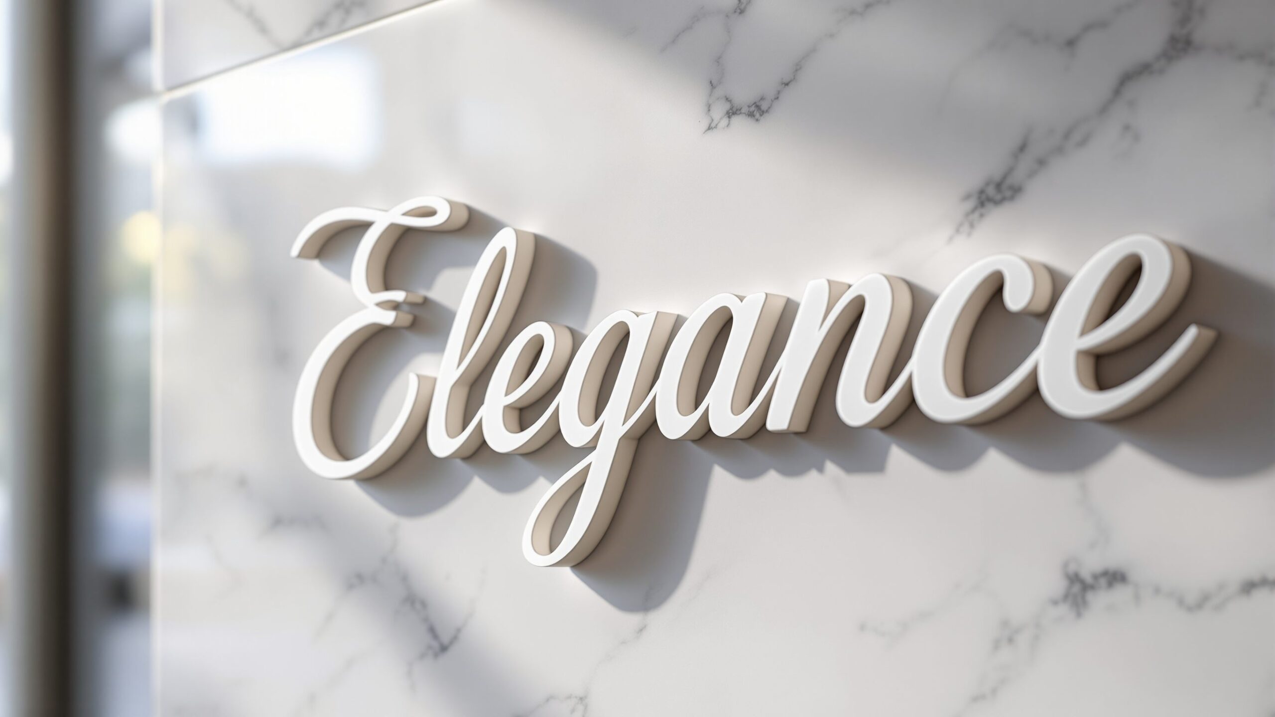
A: Metal, acrylic, and painted wood highlight fine details.
A: Usually no—headlines or names work best.
A: Yes, simplified strokes create contemporary elegance.
A: Slightly more than serif type to preserve flow.
A: Yes, but durability and contrast are essential.
A: Optional, but they enhance cohesion.
A: Overdecorating every letter.
A: Absolutely—this is a classic contrast.
A: For dense text or small-scale labels.