Hand-Lettering Techniques Turn Drawn Words Into Designed Words
Hand-lettering is the practice of drawing words as custom visual forms rather than simply writing them in a normal hand. The techniques behind it include sketching, spacing, building strokes, shaping contrast, refining curves, adding decoration, and preparing the finished piece for its final use. That may sound like a lot, but the craft becomes easier once you see each technique as a separate decision. A beginner does not need to master every style at once; the real progress comes from learning how letters are planned, adjusted, and polished.
A: Learn thumbnail sketching because it solves layout before you spend time polishing details.
A: Lettering is built and revised as a drawing, while a written script depends more on the live motion of the tool.
A: Different letter shapes create different visual spaces, so equal measurement does not always look balanced.
A: Add decoration after the plain word is readable, balanced, and structurally strong.
A: No. Pencil, paper, tracing paper, and a few pens are enough to learn the core techniques.
A: Use larger sketches, slower refinement passes, and tracing paper to separate structure from cleanup.
A: Clear letter shapes, balanced spacing, suitable contrast, and restrained decoration all support readability.
A: They should feel related, though small handmade differences can still look natural.
A: Usually one or two strong effects are better than several competing treatments.
A: Repeat one short word with different techniques so you can see what each choice changes.
Hand-lettering starts with drawing, not handwriting
Handwriting is usually fast, personal, and practical. Hand-lettering is slower and more deliberate. You are not trying to capture your natural writing exactly; you are constructing letterforms so they work as a design. A word may begin as a rough sketch, then be corrected, redrawn, thickened, simplified, spaced, decorated, or rebuilt entirely.
This difference matters because it gives beginners permission to revise. A shaky first sketch is not a failed piece. It is a map. Many strong lettering projects begin with awkward pencil lines that help the artist decide where the word should sit, how large it should be, and what personality it should carry.
Thumbnail sketching sets the direction
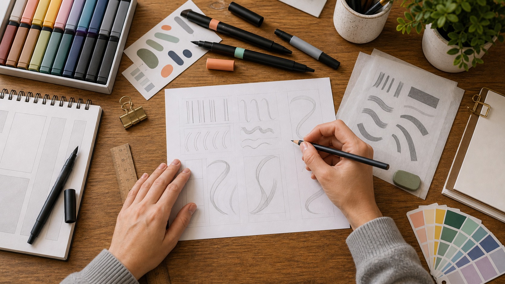
Thumbnail sketches are small rough layouts that test the main idea before details take over. They help you compare wide words, stacked words, curved baselines, centered arrangements, angled compositions, and decorative containers. Because the sketches are small, you can make several quickly without becoming attached to one version too soon.
A good thumbnail does not need perfect letters. It needs clear relationships. Which word is largest? Where does the eye enter? Does the phrase feel balanced? Is there room for descenders, flourishes, or supporting details? These early questions prevent a common beginner problem: polishing a word before the layout has been solved.
Once a direction feels promising, enlarge it and redraw. This second sketch is where proportions become more specific. You can decide whether the lettering will feel tall, compressed, round, angular, playful, formal, quiet, or bold. The style begins to emerge from the layout rather than being pasted on afterward.
Basic strokes build the letterforms
Most lettering techniques begin with simple stroke decisions. A monoline style uses strokes of nearly even width. A contrast style uses thick and thin areas. A block style builds letters from sturdy shapes. A script style connects letters with flowing joins. A dimensional style adds shadow or perspective after the main forms are stable.
Beginners often jump straight to decoration, but the main strokes carry the design. If the skeleton of the letters is weak, shadows and flourishes will not fix it. Work first on the plain version of the word. Make the shapes readable, the widths consistent, and the rhythm convincing. Decoration should come after the word can stand on its own.
Spacing is a technique of its own
Lettering spacing is not measured only by equal distance. It is judged by visual balance. A narrow letter beside a round letter may need different treatment than two straight letters side by side. Open counters, angled strokes, and swashes all change how much space feels right. This is why mechanically equal gaps can still look uneven.
One helpful beginner habit is to shade the spaces between letters lightly in your mind. If one space feels like a hole and another feels squeezed, the word will read unevenly. Adjust the shapes or the gaps until the spaces feel related. Good spacing often looks invisible, but it is one of the reasons a lettering piece feels professional.
Spacing also applies between words and lines. A two-line phrase may need tighter word spacing but more breathing room between lines. A curved layout may need adjusted spacing so letters do not collide at the center. These choices are quiet, but they decide whether the finished piece feels composed.
Contrast gives lettering energy
Contrast can come from thick and thin strokes, large and small words, straight and curved forms, dark and light areas, or plain and decorative treatments. It helps a viewer understand what to read first and what mood the piece carries. Without contrast, lettering can feel flat. With too much contrast, it can become chaotic.
The safest way to add contrast is to choose one main source. Make the key word larger, or make the downstrokes heavier, or add a shadow to one part of the phrase. When every technique appears at once, the design competes with itself. Strong lettering often looks rich because the artist limited the choices, not because they used every effect available.
Refinement turns sketches into finished lettering
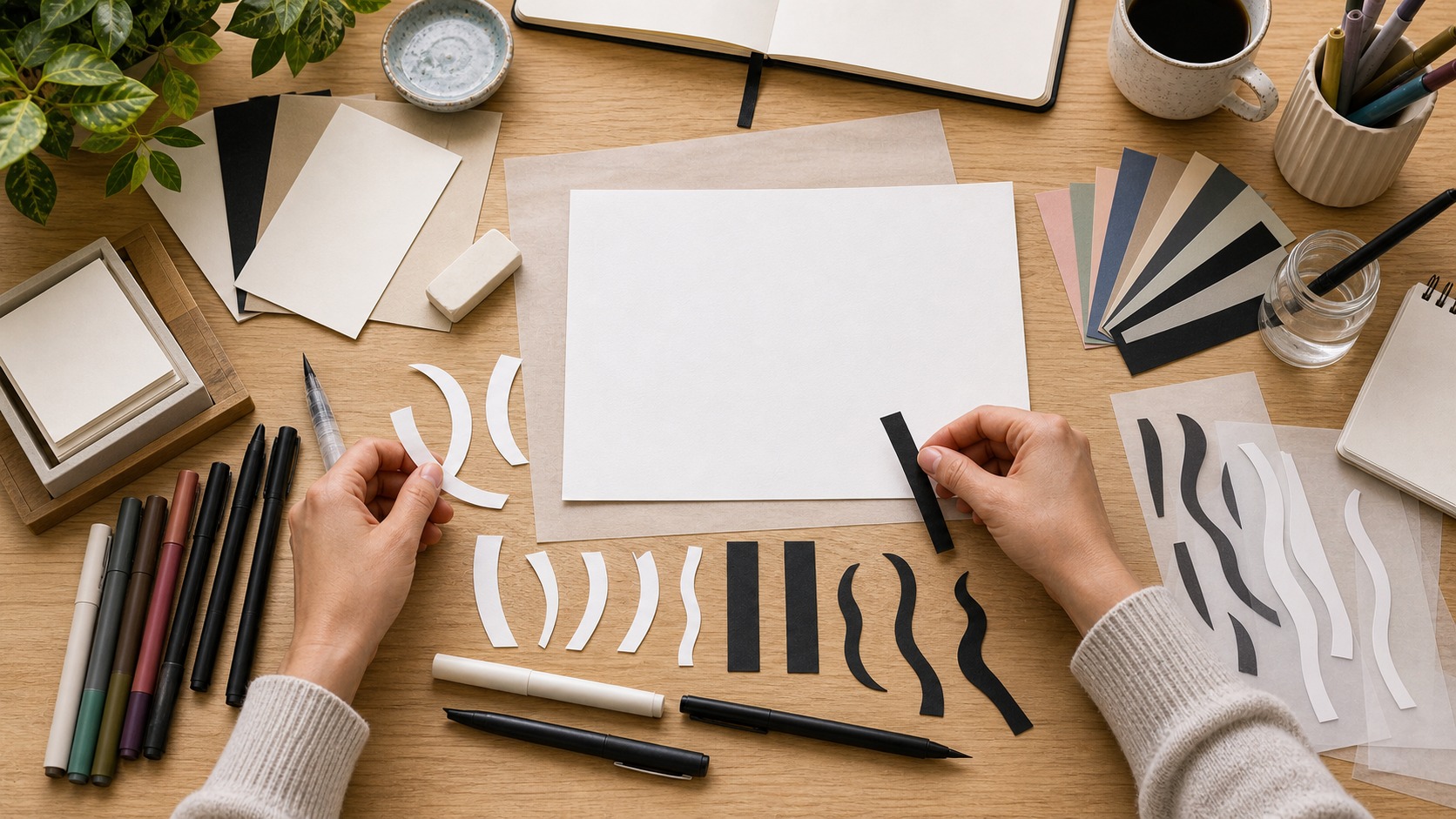
Refinement is the stage where small corrections matter. Curves become smoother, corners become cleaner, repeated letters become more consistent, and awkward joins are repaired. Tracing paper is useful here because it lets you redraw without erasing the whole idea. Each pass should improve one or two things rather than trying to fix everything at once.
Look for repeated letters first. If the same letter appears twice, the two versions do not have to be identical, but they should feel related. Then check baselines, stroke weight, spacing, and the balance of the whole shape. Turn the page upside down or view it from a distance. That makes spacing and weight problems easier to see.
Digital refinement follows the same logic. Scanning or photographing a sketch does not automatically make it finished. Vector points, curves, and edges still need judgment. The goal is not to remove all handmade character. The goal is to keep the charm while removing distractions that weaken the word.
Decorative techniques need a purpose
Shadows, highlights, inline details, banners, flourishes, textures, and borders can make lettering more expressive. They can also overwhelm it. Before adding decoration, decide what job it has. A shadow may separate the word from the background. An inline may add a vintage feel. A flourish may fill a corner or extend movement. A border may contain the phrase.
Decoration should respect readability. If a flourish crosses too many letters, the word becomes harder to read. If texture breaks up thin strokes, the design may lose clarity at small sizes. A useful test is to remove the decoration mentally. If the lettering becomes clearer, the effect may be too strong. If the decoration supports the word, keep refining it.
Color belongs in the same category. It can organize a phrase, create mood, or separate one word from another, but it should not be asked to fix weak drawing. Try reviewing the lettering in black and white first. If the structure, spacing, and hierarchy work without color, the palette can add character instead of carrying the whole design.
Beginners can make decoration easier by giving each effect a boundary. Decide whether the shadow belongs on the lower right, whether highlights stay inside thick strokes, or whether texture appears only in the background. Boundaries keep the effect consistent. They also make it easier to stop before the piece becomes crowded.
Technique should match the final use
A lettering piece for a greeting card can be delicate because viewers will hold it close. A sign needs stronger contrast and simpler forms. A logo needs to survive at many sizes. A social graphic may need instant recognition on a small screen. The same technique is not right for every setting, even when the style looks appealing.
Think about materials too. Paint, marker, pencil, ink, vinyl, embroidery, engraving, and digital output each change what details will survive. Thin hairlines that look beautiful in a sketch may disappear when printed small. Rough texture that feels lively on paper may become messy when reproduced. Practical constraints are part of lettering technique.
Audience changes the technique as well. A playful classroom sign can use softer shapes and looser rhythm because the purpose is warmth. A storefront window needs clearer silhouettes because people may see it while moving. A keepsake card can reward close inspection with small details. The more clearly you know where the lettering will live, the easier it becomes to choose what to emphasize and what to leave out.
How beginners can practice techniques
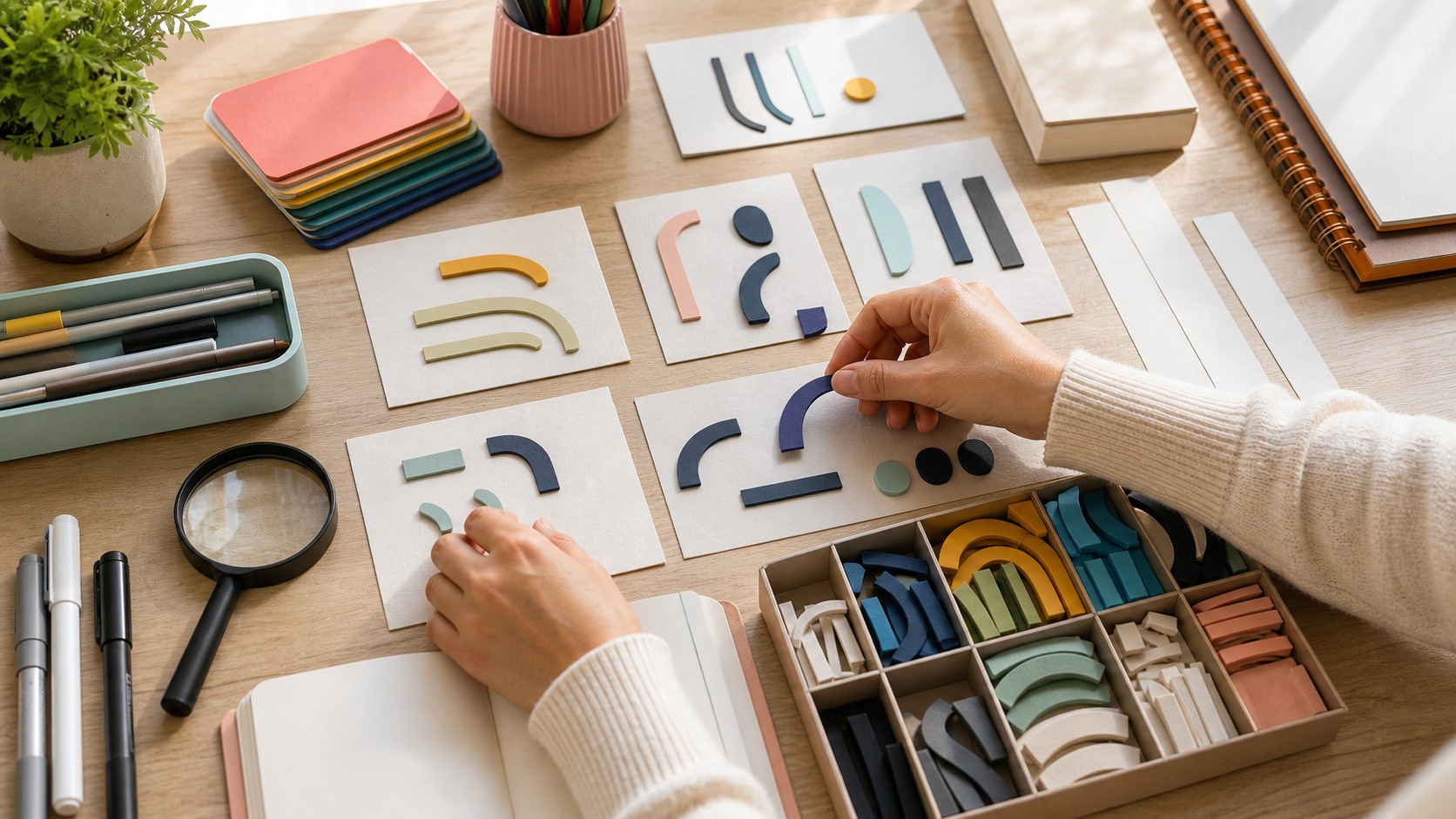
Practice one technique at a time. Draw the same word as monoline, block, script, and high-contrast lettering. Then try the same layout with different spacing. Add a shadow to one version and an inline to another. This kind of comparison teaches more than making a new phrase every time because you can see exactly what each technique changes.
Keep projects short at first. Names, labels, recipe titles, seasonal phrases, and two-word quotes are enough to practice real decisions without becoming exhausting. Save your rough drafts. They show progress and help you notice recurring habits, such as narrow spacing, oversized flourishes, or weak contrast.
The best hand-lettering technique is not a trick. It is the ability to look at a drawn word and decide what it needs next. Sometimes it needs bolder strokes. Sometimes it needs less decoration. Sometimes it needs to be redrawn from the skeleton. That patient decision-making is what turns attractive marks into lettering that feels designed.
A useful weekly exercise is to keep the same phrase and change only one variable. One day, adjust the spacing. Another day, change the weight. Another day, try a different baseline or shadow. Because the words stay the same, the effect of each technique becomes visible. That kind of focused repetition builds judgment faster than making unrelated finished pieces every time.
Review habits make technique visible
Good practice includes review, not only drawing. After finishing a sketch, cover the original reference and ask what the word communicates at first glance. Check whether the most important word is obvious, whether any letters can be misread, and whether the spacing feels even across the phrase. This short review helps beginners connect technique to the reader’s experience.
It also helps to name one improvement for the next version. Instead of saying the whole piece feels wrong, identify the next useful move: widen the counters, simplify the shadow, reduce the flourish, strengthen the baseline, or redraw the repeated letters. Specific review turns practice into progress. Over time, those small observations become the instinct that guides stronger lettering.
Photographing stages can make that review easier. A phone photo often reveals leaning lines, heavy corners, or awkward gaps that felt invisible while your hand was close to the page. Compare the photo with the sketch, mark one correction, and make another pass. This keeps critique practical instead of vague, and it teaches you to separate a promising idea from the roughness of an early draft.
Technique grows through deliberate limits
Limits make hand-lettering easier to study. Use one color, one short phrase, one shadow direction, or one style family for a practice piece. A narrow assignment reveals whether the technique is working because fewer choices are competing for attention. Once the limited version feels clear, it is much easier to add complexity with judgment, confidence, and a stronger sense of visual cause and effect in future projects.