Hand-Lettering Is the Art of Drawing Words by Hand
Hand-lettering means creating custom letterforms by drawing them, shaping them, and refining them for a particular word or phrase. It sits somewhere between writing, drawing, and design. Unlike ordinary handwriting, it is not mainly about speed or habit. Unlike choosing a font, it does not begin with a finished typeface. A beginner can think of hand-lettering as slow, thoughtful word drawing: you plan the phrase, sketch the forms, adjust the spacing, and build a piece where the letters themselves become the artwork.
A: It is the art of drawing custom words by hand for a specific design or phrase.
A: No. Hand-lettering is drawn and revised, so ordinary handwriting is not a barrier.
A: Yes. Calligraphy is usually written in flowing strokes, while lettering is drawn and adjusted.
A: Start with one short word so you can focus on shape, spacing, and balance.
A: A pencil, paper, eraser, ruler, tracing paper, and simple pens are enough.
A: They help test composition quickly before you spend time polishing details.
A: Add color after the lettering is readable and balanced in black and white.
A: Yes, but the same sketching, spacing, and refinement decisions still matter.
A: Progress depends on steady practice, but focused short projects can show improvement quickly.
A: It should show that the word is readable, balanced, and shaped with deliberate choices.
How hand-lettering differs from handwriting
Handwriting is personal and usually automatic. You write a grocery list, a note, or a signature without designing every letter from scratch. Hand-lettering is slower. You decide how the word should look, how much space it needs, which letters should be large or small, and what mood the shapes should create. The result may still feel handmade, but it is constructed with intention.
This distinction helps beginners relax. Your everyday handwriting does not have to be beautiful for you to enjoy hand-lettering. Many lettering artists have ordinary handwriting. The skill is not copying your natural hand perfectly; it is learning to draw letters with attention to structure, balance, and style.
How hand-lettering differs from calligraphy
Calligraphy is usually written with a tool that creates expressive strokes in real time. The motion of the pen, brush, or nib is central to the result. Hand-lettering may borrow calligraphic shapes, but it is often drawn, corrected, and built in stages. A script word might begin as calligraphy, then become lettering when it is redrawn, adjusted, shaded, or transformed into a custom composition.
The difference is not about which craft is better. Calligraphy celebrates controlled writing. Hand-lettering celebrates designed letterforms. They overlap often, and many artists practice both. For beginners, the distinction is useful because it tells you how to practice. If you are lettering, you can sketch, erase, trace, and revise without feeling that every stroke must be perfect on the first try.
Typography is another related word. Typography usually involves arranging existing typefaces. Hand-lettering creates a custom word or phrase. A poster might use typography for the details and hand-lettering for the title. Together, these crafts give written language different kinds of visual voice.
Knowing the distinction also helps you choose references. A calligraphy reference may teach motion and pressure, while a lettering reference may teach composition and revision. Both can be useful, but they answer different practical questions.
What beginners need to start
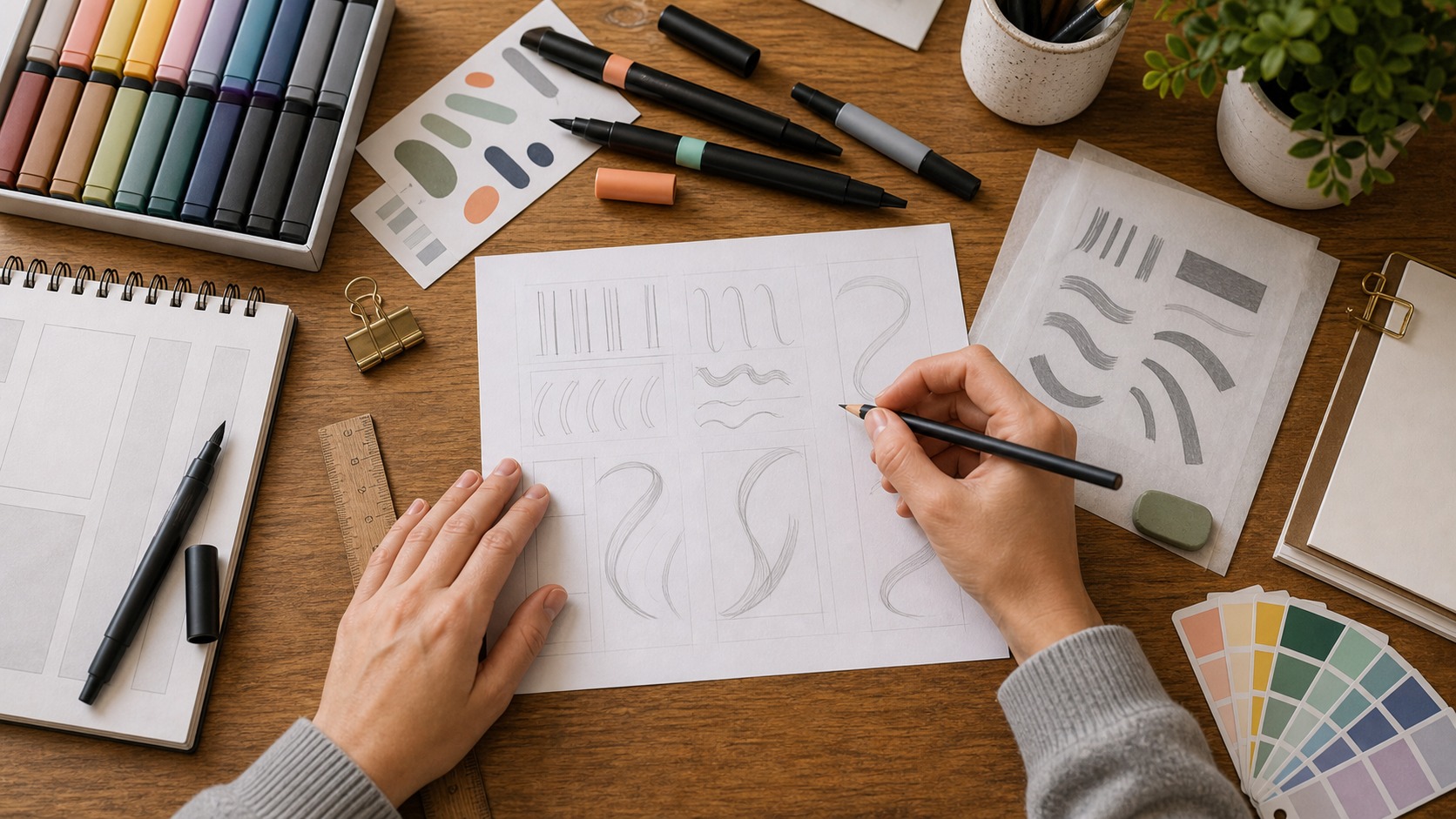
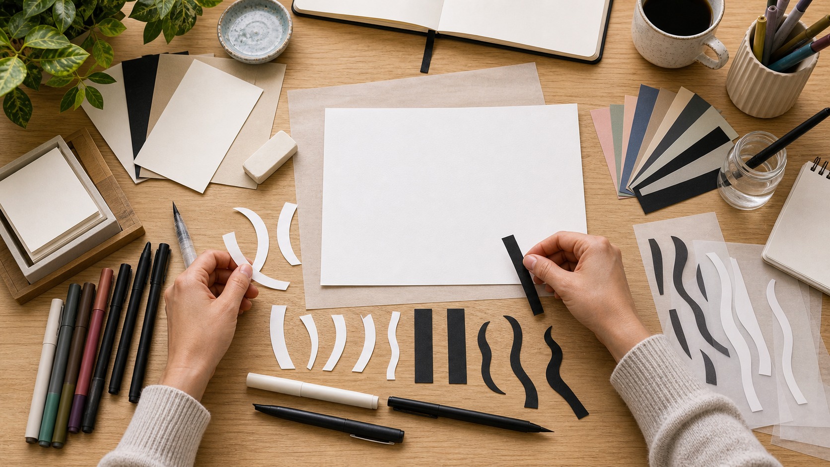
You do not need a large supply collection. Pencil, eraser, smooth paper, tracing paper, a ruler, and a few pens or markers are enough. A pencil lets you explore without pressure. Tracing paper lets you refine a sketch in layers. Pens and markers help you test weight, contrast, and final texture once the structure feels ready.
Choose tools that make practice easy rather than impressive. A basic mechanical pencil can be more useful than a fancy marker if it helps you sketch often. A simple black pen can teach contrast, spacing, and cleanup. Beginners improve by making decisions, not by owning every tool that appears in a studio photo.
The basic hand-lettering process
Most hand-lettering projects begin with the phrase. Short phrases are best at first because each word needs attention. Write the words plainly, then decide which word matters most. That word may become larger, bolder, curved, centered, or decorated. The supporting words should help the main word rather than compete with it.
Next, make thumbnails. These are small rough sketches that test layout. Try a stacked version, a wide version, a curved version, and a simple centered version. Do not polish yet. The goal is to find the arrangement with the clearest structure. Once you choose a thumbnail, redraw it larger and begin shaping the letters more carefully.
After the larger sketch works, refine in passes. One pass might improve spacing. Another might smooth curves. Another might add weight or decoration. This layered approach keeps the work manageable. It also teaches you to see lettering as a sequence of improvements rather than a single perfect drawing.
Letter shapes and style choices
Hand-lettering can be simple, ornate, playful, formal, vintage, bold, delicate, geometric, organic, or expressive. Style begins with basic shapes. Tall narrow letters feel different from wide rounded letters. Sharp corners feel different from soft curves. Heavy block forms feel different from light script forms. Beginners can learn a lot by drawing the same word in several different structures.
Style should match the message. A birthday card can feel cheerful and loose. A wedding piece may need elegance and restraint. A classroom label may need friendly clarity. A product sign may need quick recognition. When style supports the purpose, the lettering feels natural. When style is chosen only because it looks trendy, the piece can feel disconnected from the words.
Readability still matters. Decorative letters are fun, but the viewer should not have to solve a puzzle. If a letter becomes too unusual, compare it with the rest of the alphabet. If a word becomes hard to read, simplify the shapes before adding more effects.
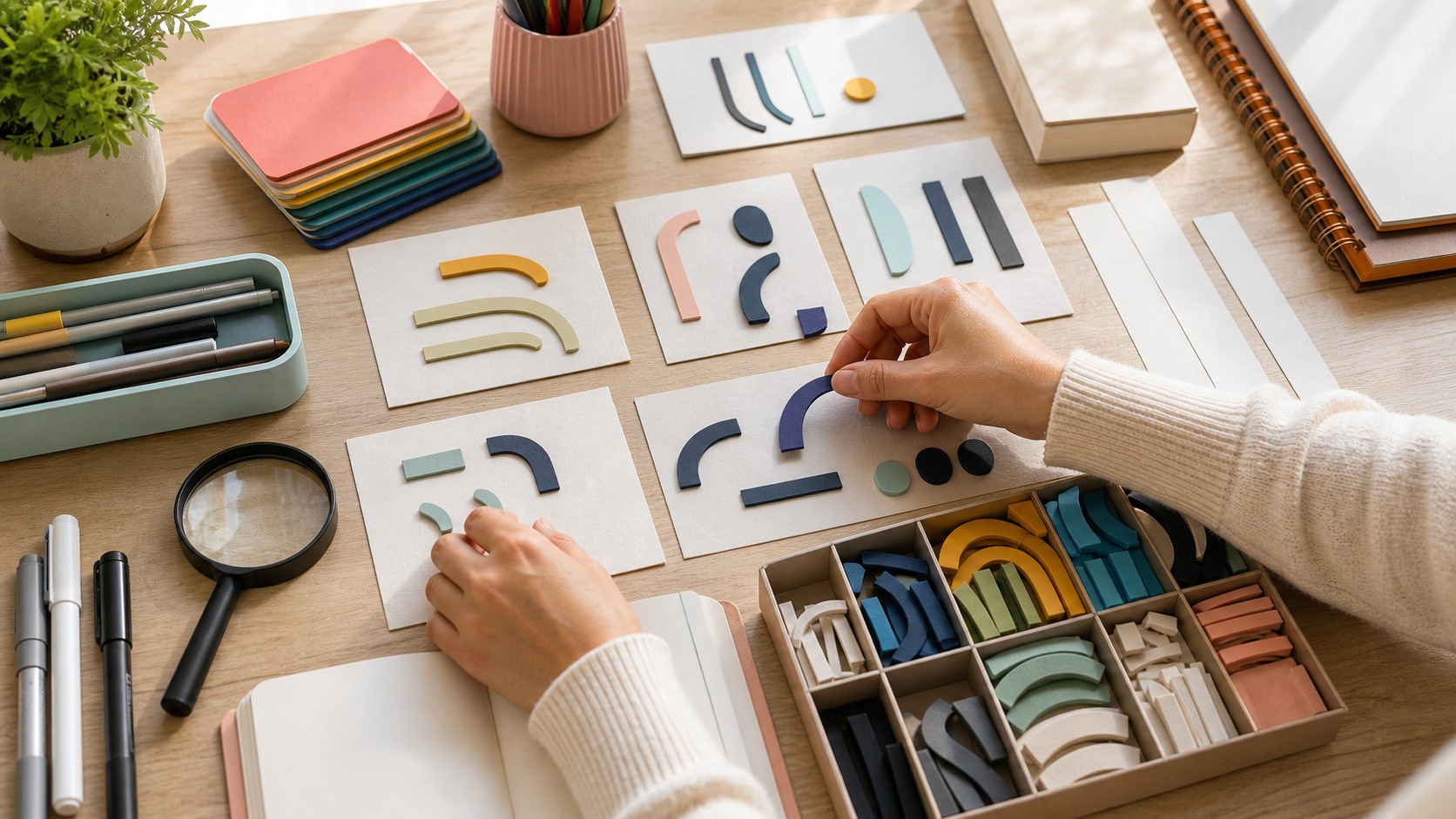
Beginners can build a small style library by studying shape choices instead of copying whole pieces. Notice whether a sample uses rounded corners, heavy verticals, open counters, narrow spacing, or dramatic swashes. Those observations become ingredients you can combine thoughtfully. The point is not to imitate someone else’s exact phrase, but to understand what each visual choice contributes.
Spacing, balance, and composition
Spacing is one of the hardest beginner skills because it is visual rather than purely mathematical. Equal gaps do not always look equal. Round letters, slanted letters, and letters with open counters all affect the space around them. Good spacing means the word feels evenly paced, with no awkward holes or cramped spots.
Composition is the arrangement of the whole phrase. A design can feel heavy on one side, crowded at the top, or empty in the middle even when the letters themselves are nice. Step back from the page and look at the shape of the whole piece. Squint if that helps. You are checking whether the words form a clear, balanced visual unit.
A simple frame can help beginners see composition. Draw a light box around the phrase and notice where the lettering presses against it or leaves awkward emptiness. That boundary makes balance easier to judge before you commit to ink.
Common beginner mistakes
One common mistake is decorating too soon. Shadows, highlights, banners, and flourishes are exciting, but they cannot rescue weak structure. Another mistake is using too many styles in one phrase. A script word, block word, serif word, shadow, banner, texture, and border can all be beautiful separately, yet overwhelming together.
Beginners also tend to skip rough drafts. They may draw a phrase once and feel disappointed when it does not look finished. Lettering needs revision. The first sketch is information. It shows what is working and what needs adjustment. Treating the rough draft as part of the process makes practice far more enjoyable.
Another mistake is comparing early work to polished professional pieces. Finished lettering often hides the drafts, tracing layers, rejected versions, and digital cleanup behind it. Your practice sheets are allowed to look unfinished. They are where the eye and hand learn to cooperate.
It is also easy to make every word equally important. If all the words are the same size, same weight, and same energy, the viewer has no clear path through the phrase. Choose one lead word and let the other words support it. That simple hierarchy can make beginner lettering feel calmer immediately.
Simple ways to practice
Start with one word. Draw it in plain capitals, rounded letters, block letters, and loose script. Then choose the clearest version and refine it. This exercise teaches style without overwhelming you with a long phrase. It also shows how much personality can change even when the word stays the same.
Use tracing paper for three-pass practice. On the first pass, fix the layout. On the second pass, improve the letter shapes. On the third pass, clean the spacing and add one restrained detail. This method keeps practice focused. It also gives you a visible record of improvement.
Make small projects that have a use: a recipe title, a gift tag, a journal heading, a seasonal card, a shelf label, or a short quote for your desk. Practical projects create natural limits. They tell you how big the lettering should be, how clear it needs to be, and how much decoration the surface can handle.
Repeat projects are especially useful. Letter the same recipe title once as simple block letters, once as rounded casual lettering, and once as a loose script. The comparison teaches style more clearly than jumping to a new phrase every time. You start to see which choices change mood, which choices improve readability, and which choices are only decoration.
Give each practice session a finish line. Ten thumbnails, one refined word, or one spacing correction is enough. Clear limits make practice easier to repeat, and repetition matters more than a single ambitious piece that becomes too large to finish.
Why hand-lettering is worth learning
Hand-lettering teaches you to look closely at words. You begin to notice curves, spacing, rhythm, weight, balance, and tone. Those skills help with many other visual crafts, from typography and logo design to signs, cards, journals, murals, and digital graphics. Even simple lettering practice can sharpen your design eye.
It is also satisfying because it combines discipline with personality. You can follow basic principles while still making choices that feel like your own. The goal is not to draw like everyone else. The goal is to make words that are readable, expressive, and thoughtfully shaped. For beginners, that is a generous place to start.
How to know a lettering piece is working
A beginner piece is working when the word can be read quickly, the layout feels balanced, and the style supports the message. It does not have to be flawless. The curves may still need practice and the ink may not be perfect. What matters is that the major choices make sense together. The viewer should understand the phrase before noticing the effort behind it.
Ask a few simple review questions. Is one word clearly leading? Are the spaces calm? Do the decorative parts help the phrase? Would the piece still work if it were smaller? These questions turn taste into something you can practice. They also keep hand-lettering from becoming only decoration, because the final test is whether the drawn words communicate with clarity and character.
When the answer is no, revise one thing at a time. Make the lead word larger, open the tightest space, quiet the busiest decoration, or redraw the most confusing letter. Small corrections teach you what the piece needs. They also make the next blank page less intimidating because you know how to respond when a sketch is not working yet.