Hand-Lettering Techniques Help You Draw Better Letterforms
Hand-lettering is the art of drawing letters, not simply writing them. That difference matters for beginners. In handwriting, the goal is usually speed and legibility. In calligraphy, the tool and stroke motion create the form. In hand-lettering, you can sketch, revise, thicken, reshape, erase, and refine each letter as a drawn object. Good hand-lettering techniques help you build letters with structure, rhythm, contrast, and personality. You do not need perfect handwriting to begin. You need observation, patience, and a process that moves from rough ideas to clearer forms.
A: No. Calligraphy is written with controlled strokes, while hand-lettering is drawn and refined.
A: No. Lettering depends more on drawing, observation, and revision.
A: Start with guide lines, rough word shapes, and simple thumbnails.
A: Pencil lets you test structure, spacing, and composition before committing.
A: Use guide lines, repeat shapes intentionally, and compare spacing visually.
A: After the basic letters are readable, balanced, and structurally clear.
A: Spacing is one of the most important because it affects readability immediately.
A: Yes, but the same principles of structure, spacing, contrast, and refinement still apply.
A: They let you test composition quickly before spending time on details.
A: Through sketching, comparing, revising, and improving one decision at a time.
Start with pencil structure
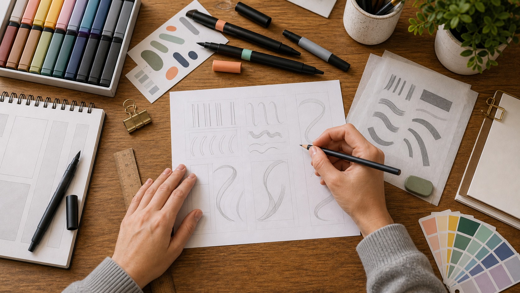
Pencil structure gives the word a chance to become clear before ink makes decisions permanent. Beginners can test height, width, slant, and spacing without worrying about a perfect line. The goal is to find the bones of the word first.
Strong hand-lettering usually begins lightly. A pencil sketch lets you explore shape before committing to ink. Beginners should start with simple guide lines for height, baseline, slant, and spacing. These guides do not have to be complicated. They simply give the letters a place to sit and help the word feel intentional. Without structure, decorative details tend to drift.
Sketching also reduces pressure. The first version does not need to be beautiful. It only needs to reveal the idea. You can draw a word quickly, then adjust width, weight, spacing, and balance. Hand-lettering improves through revision. The pencil stage is where many of the best decisions happen.
Understand the difference between lettering and calligraphy
Calligraphy is written with controlled strokes from a tool. Hand-lettering is drawn and refined. The two practices overlap, and many artists use both, but they are not identical. A calligrapher may create a word in one flowing motion. A lettering artist may build the same word through sketching, adjusting, and redrawing. This gives hand-lettering flexibility.
Because lettering is drawn, you can create styles that would be difficult to write naturally. You can make block letters, script-inspired letters, dimensional letters, shadowed letters, illustrated letters, or playful custom forms. The challenge is keeping the word readable while adding personality. Technique helps decoration serve the structure.
Build letters from simple shapes
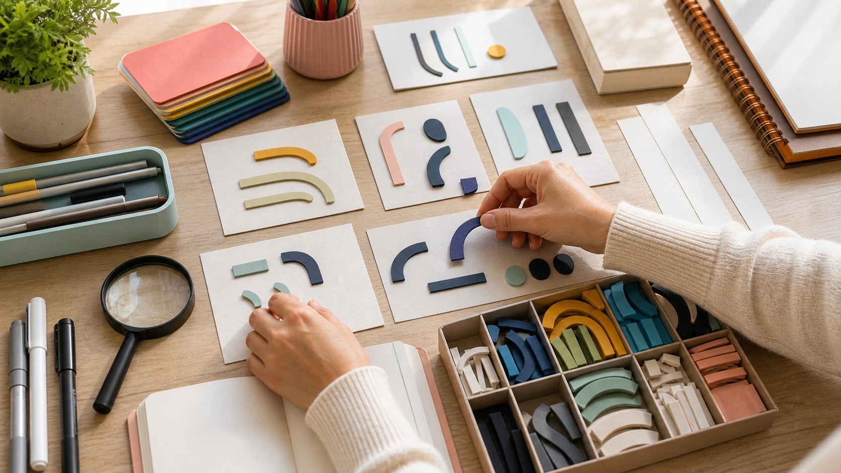
Simple shapes are not childish; they are the construction system beneath stronger lettering. Rectangles, ovals, curves, and diagonals help you compare letters that otherwise feel unrelated. Once those forms are balanced, style can grow on top of them.
Beginners often improve quickly when they stop seeing letters as mysterious forms and start seeing them as shapes. Stems, curves, bowls, bars, diagonals, and terminals can be drawn, compared, and adjusted. A rounded letter may need to extend slightly beyond guide lines to look visually equal. A diagonal may need different spacing from a vertical stroke. Drawing letters teaches the eye to balance shapes.
Start with basic styles. Try simple block letters, then add weight. Try monoline script, then add contrast. Try tall narrow letters, then wide friendly letters. Each exercise teaches proportion. You are not trying to create a masterpiece immediately. You are learning how changes in shape affect mood and readability.
Use contrast with intention
Contrast is one of the most powerful hand-lettering techniques. It can mean thick and thin strokes, large and small letters, dark and light areas, simple and decorative forms, or tight and open spacing. Contrast gives lettering energy. Without it, a piece can feel flat. With too much, it can feel chaotic.
For beginners, stroke contrast is a good place to start. Decide where the thick parts belong. In script-inspired lettering, downstrokes are often thicker. In block lettering, weight may be distributed more evenly. In decorative lettering, contrast may come from shadows, inline details, or outlines. The important thing is consistency. Random thickness makes letters look uncertain.
Spacing makes words readable
Spacing is easier to judge when you look at the empty areas as shapes. A gap that feels too bright or too dark will interrupt the word. Adjusting those spaces often improves the piece more than adding another decorative effect.
Spacing is not an afterthought. It is one of the main reasons lettering succeeds or fails. Letters need to feel evenly spaced, but equal measurement does not always look equal. A round shape beside a straight shape creates different space than two straight shapes together. Beginners should judge spacing visually, not only mechanically.
A useful trick is to look at the spaces between letters as shapes of their own. Are some gaps huge while others are squeezed? Does the word break into pieces? Does one letter crash into another? Adjusting spacing can make a simple word look much more polished. Good lettering often depends on invisible decisions.
Plan composition before details
Hand-lettering is not only individual letters. It is also composition. A quote, phrase, logo concept, or sign needs arrangement. Which word is most important? Should the phrase stack, arc, curve, or sit on one line? Where should the viewer’s eye begin? Composition answers those questions before decorative details appear.
Thumbnail sketches help. Draw several tiny layouts quickly. Do not refine them yet. Test different word sizes, line breaks, shapes, and emphasis. A small thumbnail can reveal whether a phrase has balance. Once the composition works, the final lettering becomes easier. Beginners who skip thumbnails often spend too much time polishing a weak layout.
Add style after the skeleton works
Style is most convincing when it supports an already readable word. Shadows, serifs, texture, and flourishes can add personality, but they should not carry the whole design. If the plain sketch works, the styled version has a stronger foundation.
Decorative techniques are exciting: shadows, highlights, outlines, flourishes, texture, color, dimensional effects, and illustrative details. They can make lettering memorable. But decoration should come after the basic skeleton works. If the letterforms are uneven, decoration will not fix them. It may only make the problem louder.
Start with one style effect at a time. Add a simple shadow. Try a consistent outline. Add one flourish where the word has room. Test texture lightly. Too many effects can make beginner lettering feel crowded. Restraint makes style look intentional. The goal is to enhance the word, not bury it.
Refine in stages
Good hand-lettering usually moves through stages: rough sketch, structure, spacing, weight, style, cleanup, and final finish. Each stage has a different question. Does the idea work? Are the letters readable? Is spacing balanced? Is weight consistent? Does the style match the message? Are the edges clean? This staged approach keeps the process from becoming overwhelming.
Refinement is where beginners often grow the most. Instead of redrawing the whole piece immediately, identify one issue. Maybe one letter is too wide. Maybe the baseline dips. Maybe a flourish steals attention. Fixing one problem at a time teaches control. It also makes finished work feel more deliberate.
Choose materials that support learning
Materials should match the stage of practice. Cheap paper may be fine for thumbnails, while smoother paper helps with final ink. A limited set of dependable tools keeps attention on decisions rather than on constantly changing supplies.
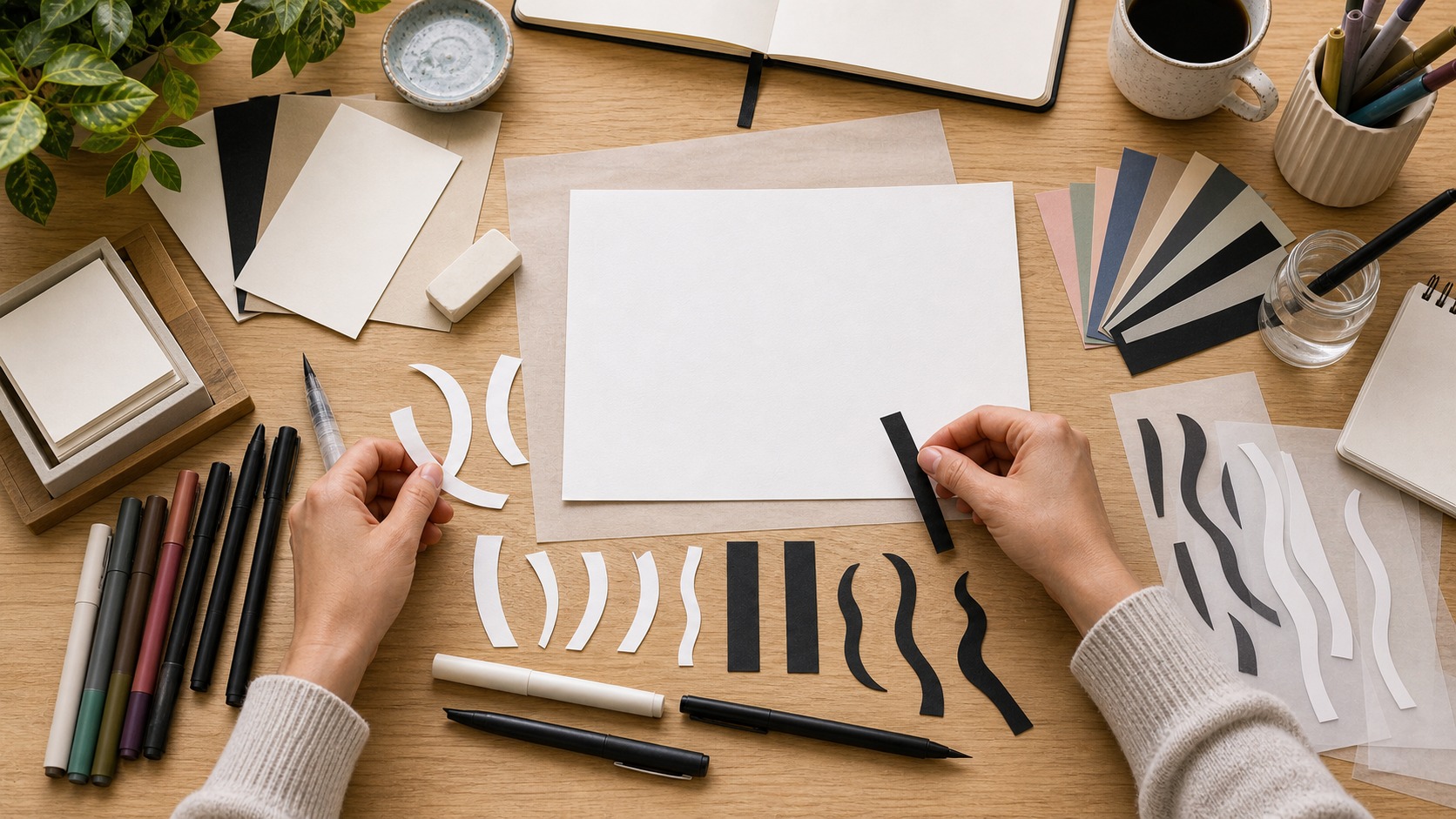
You can practice hand-lettering with simple materials: pencil, eraser, paper, ruler, fineliner, marker, and tracing paper. Tracing paper is especially useful because it lets you revise over earlier sketches without starting from nothing. Markers can help explore weight. Colored pencils can test palettes. Digital tools can help later, but the core skill is still seeing and shaping letters.
Beginners should not wait for perfect supplies. Better tools can help, but they do not replace observation. A pencil sketch on ordinary paper can teach proportion, rhythm, and composition. Start with what you have, then upgrade when you understand what problem a new tool will solve.
Practice beautiful letters through projects
Practice becomes more meaningful when it has a purpose. Letter a short name, a recipe title, a seasonal phrase, a label, a greeting card, or a small sign. Keep the phrase short enough to finish. Choose one technique to focus on, such as spacing, contrast, or shadow. This keeps practice manageable.
Project practice also teaches real constraints. A greeting card has limited space. A label needs quick recognition. A sign may need stronger contrast. A recipe title may need warmth. These constraints help beginners make decisions instead of decorating randomly. They also make practice more satisfying because the finished piece has a use, even if it is small.
Try repeating the same phrase in different styles. Draw it once as simple block lettering, once as script-inspired lettering, once with a shadow, and once with wide spacing. Comparing the versions helps you understand how technique changes mood. It also shows which techniques feel natural to your hand and which need more focused practice.
Feedback is easier when the goal is specific. If you practiced spacing, judge the spacing rather than every detail. If you practiced shadows, check whether the shadow direction stayed consistent. If you practiced composition, ask whether the most important word leads the eye. Focused review keeps improvement from feeling overwhelming.
As you build confidence, create a small library of your own solutions. Keep examples of a shadow that worked, a layout you liked, a spacing fix that improved a word, or a color combination that supported the lettering. This personal reference becomes more useful than copying someone else’s style because it records your own decisions.
Hand-lettering also benefits from studying existing letters in the world. Look at signs, book covers, packaging, menus, and posters. Notice which letters feel balanced and which feel awkward. Ask how spacing is handled, where contrast appears, and how the composition guides the eye. This kind of looking trains judgment even when you are not drawing. It turns everyday lettering into practice material.
When a piece feels unfinished, resist the urge to add more decoration immediately. Often the solution is simpler: adjust one curve, open one space, align one word, or reduce one effect. Beginners commonly add shadows, highlights, and texture to compensate for weak structure. Strong lettering usually becomes more beautiful when the underlying forms are corrected first.
It is worth practicing both slow refinement and quick ideation. Slow refinement teaches precision. Quick ideation teaches variety. Spend one session polishing a single word, then another session drawing twenty tiny layout ideas. Both skills matter. Beautiful letters need care, but creative lettering also needs options.
Beginners should also learn when to stop. A piece can become weaker if every empty space receives a shadow, flourish, or texture. Let some areas stay quiet. Quiet space gives the main lettering room to work and helps the viewer understand the composition. Restraint is a hand-lettering technique too.
Over time, the process becomes more intuitive. You will sketch lighter, revise more efficiently, and notice spacing problems earlier. You will recognize which decorative effects match a phrase and which ones distract from it. That confidence does not come from a single perfect tool. It comes from repeating the process until your eye and hand begin to cooperate.
The same process works whether you prefer paper or digital tools. Digital lettering can make revision easier, but it still depends on structure, spacing, contrast, and composition. Paper lettering can feel more immediate, but it still benefits from planning and stages. The medium changes the workflow, not the underlying principles.
That is why beginner hand-lettering techniques are so valuable. They give you a repeatable path for turning a rough idea into a clearer piece of lettering, one decision at a time.
With that path, beautiful letters become less mysterious. They are not simply lucky sketches or natural talent. They are the result of structure, spacing, contrast, composition, and patient revision. Those skills can be practiced, and every small project gives you another chance to strengthen them.
The more you repeat the process, the more your lettering begins to show intention. Lines feel steadier, spaces feel calmer, and decorative choices start to support the words instead of competing with them.
Beautiful hand-lettering grows from many small decisions made with care. Draw lightly. Compare shapes. Adjust spacing. Add contrast. Plan composition. Refine patiently. Over time, your letters will become more confident because your eye will know what to fix. Hand-lettering is not about drawing perfect letters on the first try. It is about building better letters through an intentional process.